Before attendees read a single word, they’ve already judged your conference website. In less than 50 milliseconds, their brains form an impression—deciding whether your event feels credible, engaging, and worth exploring. That’s faster than a blink.
So what does your homepage really say about you?
Let’s unpack the psychology behind first impressions and how your digital front door can either invite curiosity—or drive it away.
Humans are wired for snap judgments. Our brains rely on visual and emotional cues to make quick decisions, especially in unfamiliar environments. This means your homepage isn’t just a design—it’s a neurological handshake.
Key psychological principles that required:
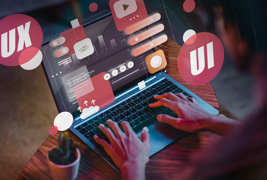
What Your Homepage Communicates Instantly
1. Credibility
A clean, modern design signals professionalism. Outdated visuals or cluttered layouts can suggest disorganization—even if your event is world-class.
Tip: Use high-quality imagery, consistent branding, and clear hierarchy to build trust fast.
2. Clarity
Visitors should know what your conference is about within seconds. If they have to scroll or decode jargon, you’ve lost them.
Tip: Include a concise tagline, date/location, and a bold call-to-action above the fold.
3. Value
Your homepage should answer: Why should I attend? Highlight key benefits—networking, learning, exposure—and make them visually scannable.
Tip: Use icons, short blurbs, or a hero video to showcase value without overwhelming.
4. Emotion
Design evokes feeling. Warm colors, human imagery, and inclusive language create a sense of welcome. Cold, sterile layouts can feel distant.
Tip: Feature real attendee photos, testimonials, or speaker quotes to build emotional resonance.
Mobile Matters More Than Ever
With over 60% of users browsing on mobile, your homepage must be responsive and fast. A slow or broken mobile experience can ruin your first impression entirely.
Tip: Test your homepage across devices and prioritize load speed, tap-friendly buttons, and vertical flow.
Real-World Examples of Homepage Impact
These aren’t just design tweaks—they’re psychological nudges that shape behavior.
In Short
Your homepage is not more than a landing page—it’s a digital handshake for an event everyone needs to attend. By understanding the science of first impressions, you can design a homepage that doesn’t just inform—it inspires.
Because in the world of conferences, the first impression isn’t just the beginning—it’s the invitation to belong.